
Selected work / Supplements & wellness
Supplement
packaging systems.
A supplement range has to stay recognizable as the formula, flavor and pack format change. These projects show how I build that consistency across products.
Selected client work, 2020–2026 / Concept development, range architecture and production artwork
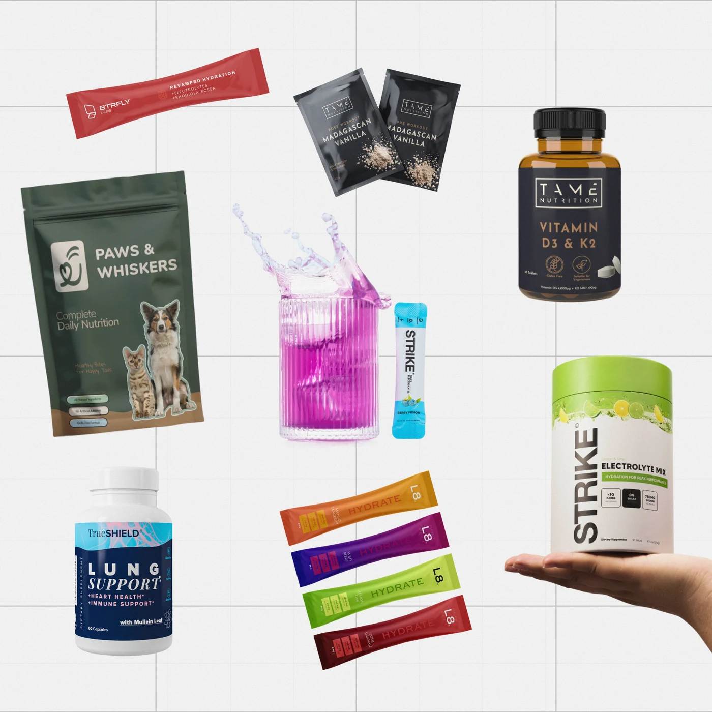
01 / Concept exploration
Set the range direction.
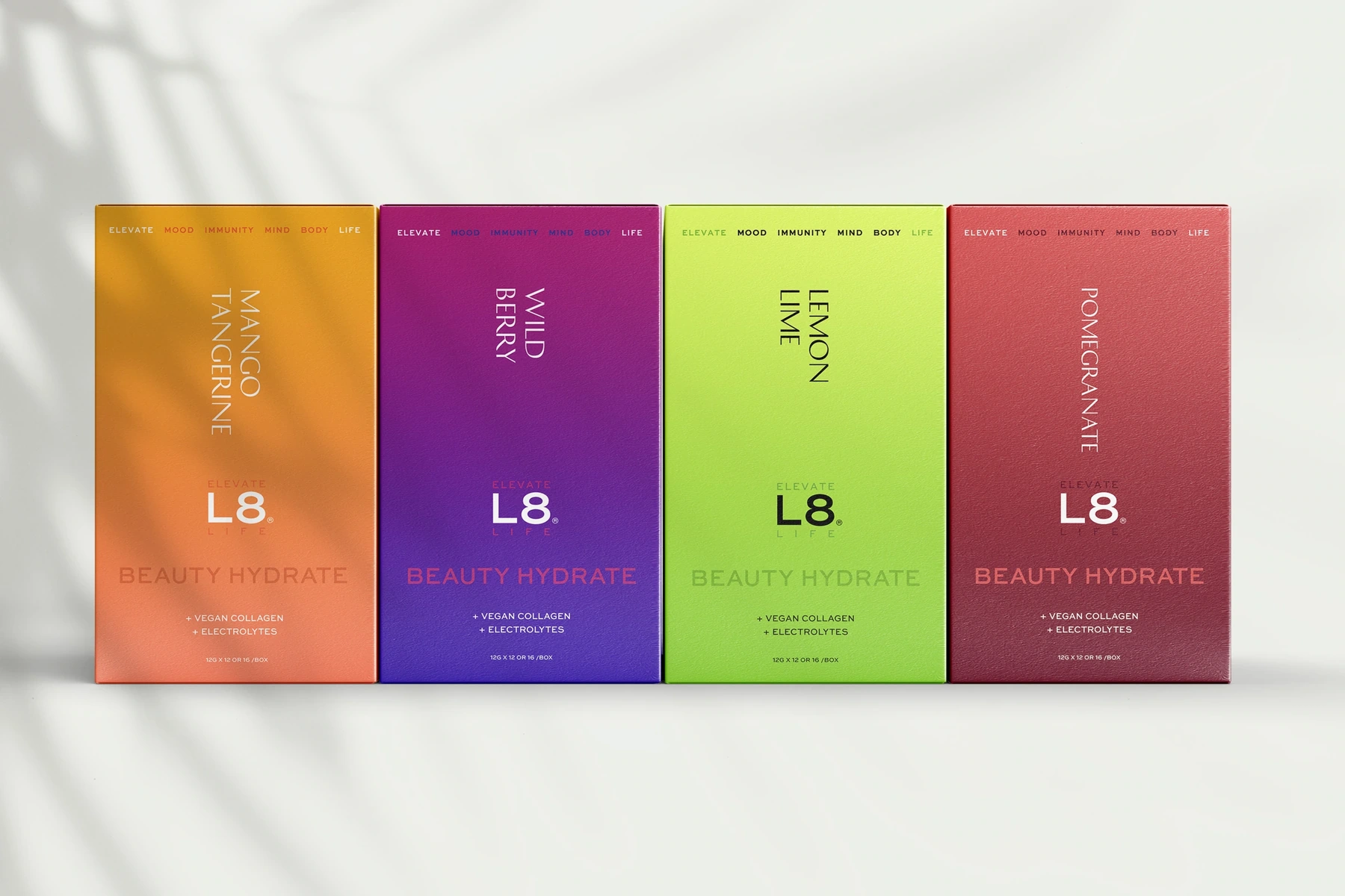
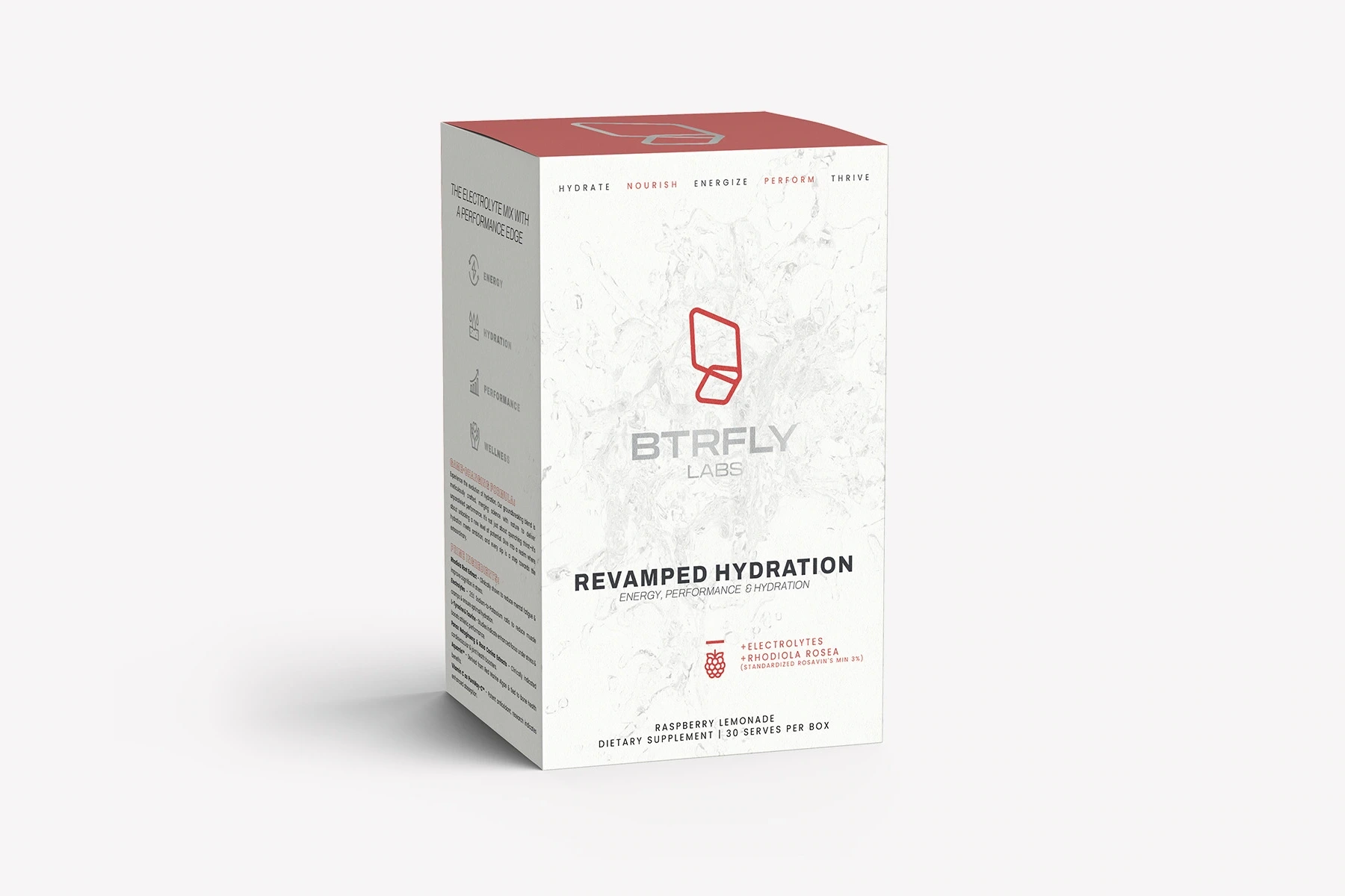
I explored how L8 Life’s hydration flavors could read as one range across cartons and sachets. For BTRFLY Labs, I used a tighter type and color system to organize the information on performance hydration packaging.
02 / Market validation
Give the range a form people can evaluate.
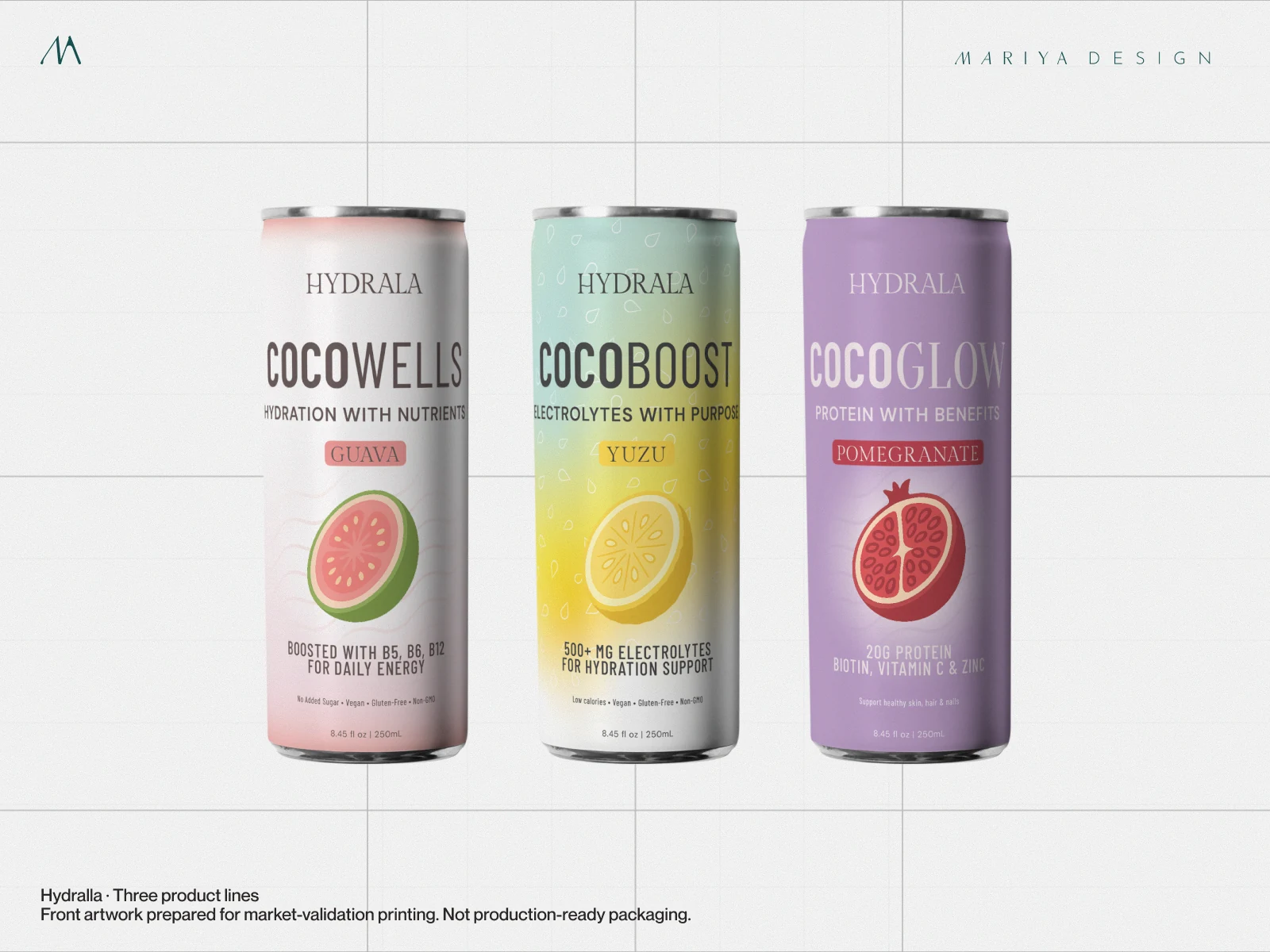
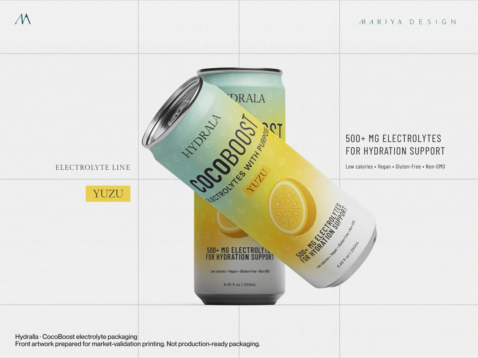
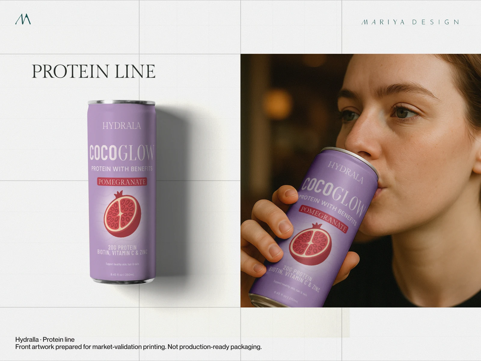
For Hydralla, I developed naming, brand direction and packaging across electrolyte, protein and wellness drinks. The front artwork was prepared for market-validation printing and investor conversations, ahead of manufacturing decisions.
03 / Range design
Carry the hierarchy across formats.
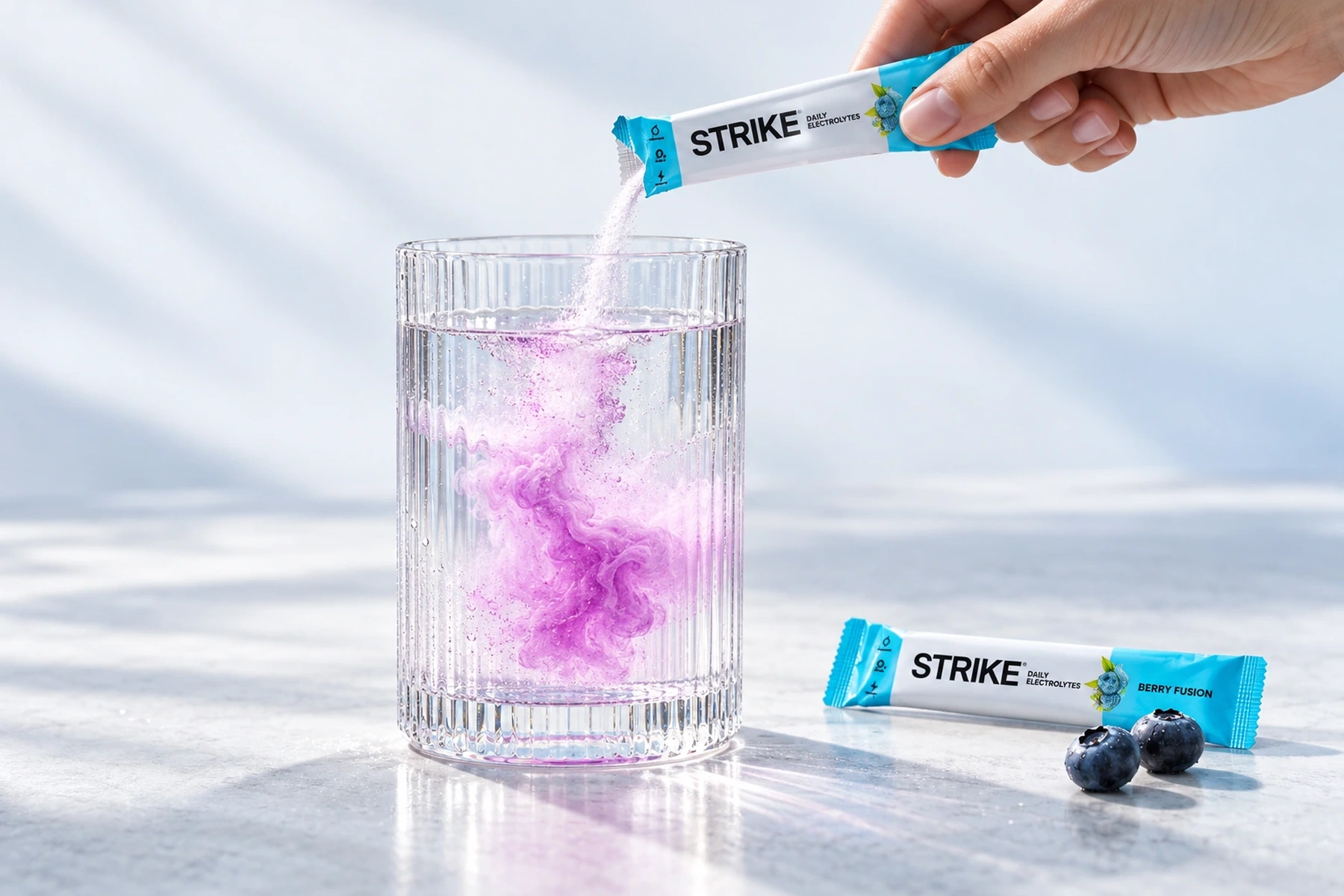
Strike Nutrition uses a vertical wordmark, consistent claim placement and flavor-led color across tubs, sachets and sampler formats. The same information stays easy to find as the available space changes.
04 / Production artwork
Prepare the approved design for print.
For TrueSHIELD, I developed the identity, supplement labels and guidelines together. For Tame Nutrition, I brought the bottle range through to production artwork and explored sachets as a separate format.
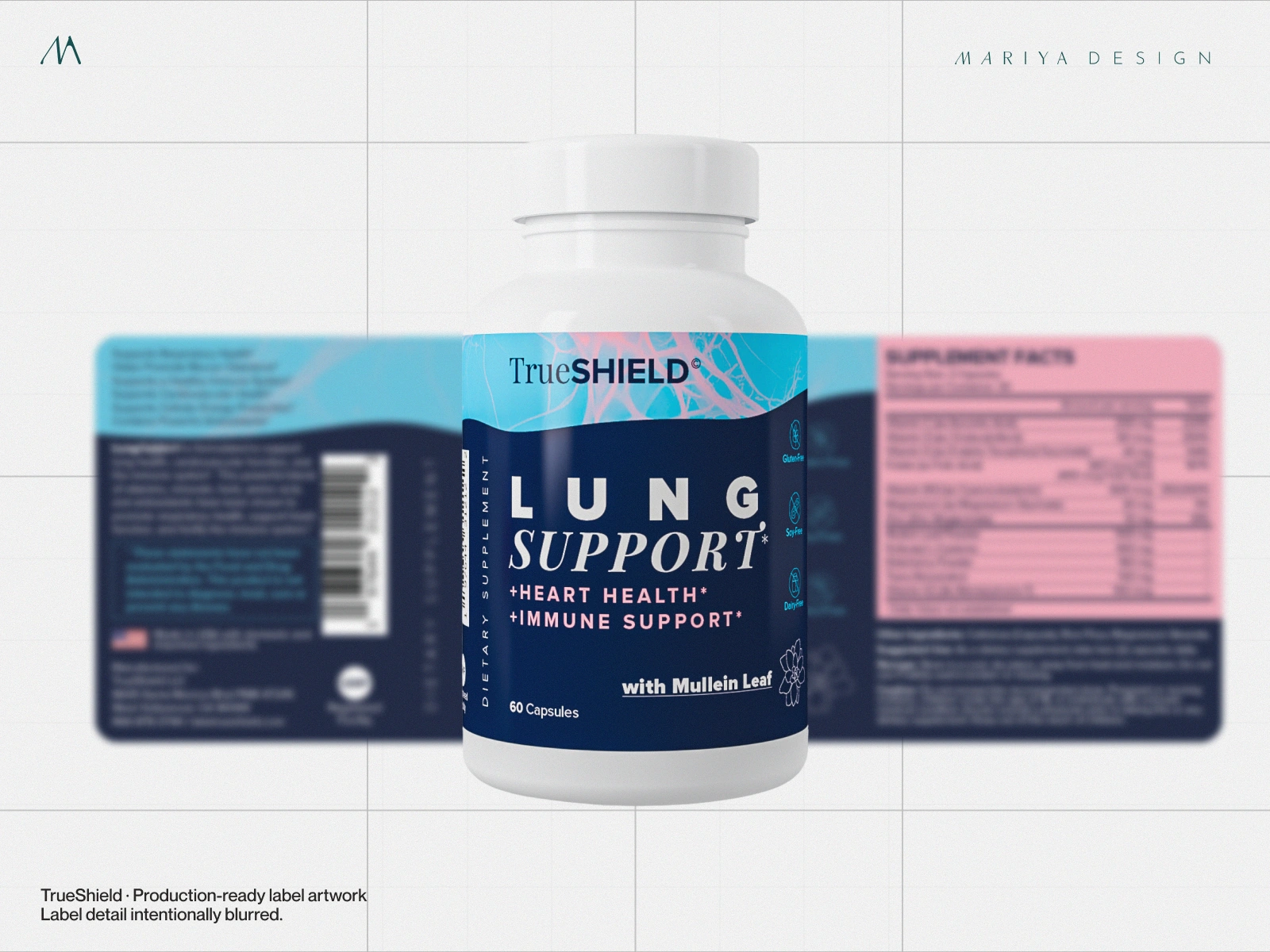
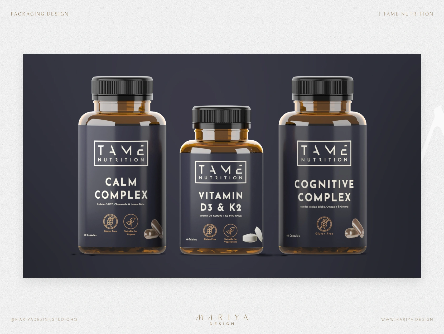
Depending on the scope, I prepare full label or carton layouts, format and flavor adaptations, and print files against the supplier’s confirmed specifications.